
• Client
Epson Singapore
• Year of Completion
2023
• Services
Brand Audit
Brand Strategy
Digital Brand Assets
• Sectors
Global Technology
• Location
Singapore
Epson Singapore
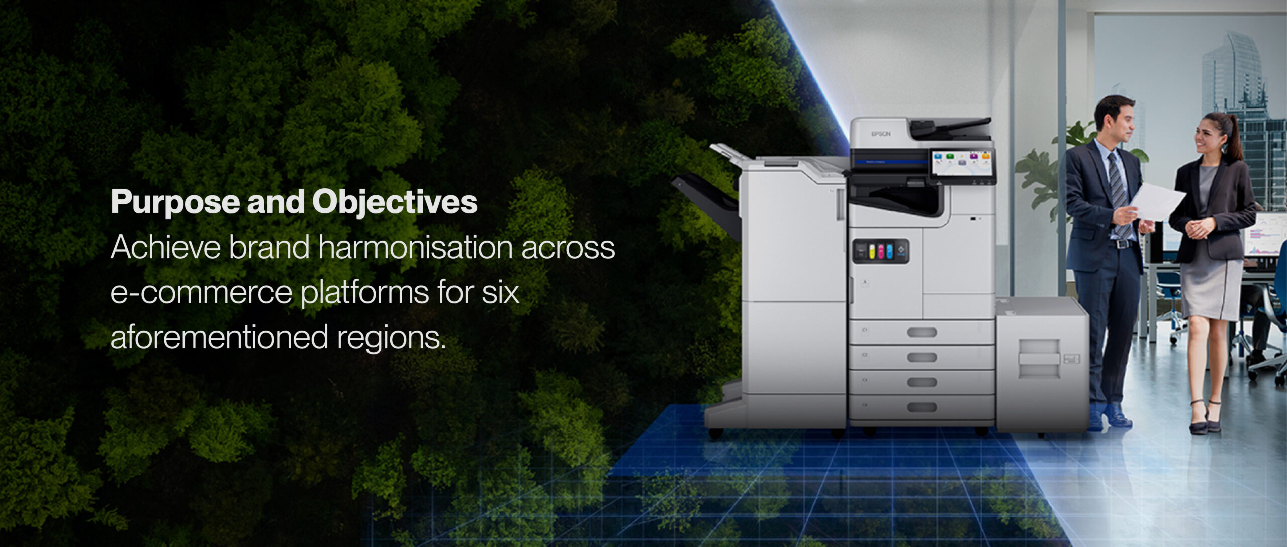
Brand Harmonisation Playbook
As a prominent global technology leader, Epson encountered a significant challenge - inconsistent online branding across various
e-commerce stores and regions. This inconsistency not only diminished its professional image but also caused confusion among potential online consumers and shoppers.
We compiled these insights into a concise playbook, providing Epson with clear rules and templates to enforce consistency throughout its online branding. This playbook, which is easy to comprehend, implement, and oversee, has empowered Epson to maintain a consistent online brand image across six Southeast Asian countries through both official stores and external partners.
KEY OPPORTUNITIES
Through this brand harmonisation exercise, we aim to achieve the following objectives based on challenges presented by Epson Official Store managers and Authorised Partner member.
Brand Consistency
To ensure consistency and on-brand applications of all Epson brand assets and communications on online e-commerce marketplaces.
Recognisability
To create and build stronger recognisability and identification of Epson Official Stores across all existing marketplace territories.
Brand Education
To educate Authorised Partners on Epson's
brand regulations and formalise how Authorised Partners may apply co-branding on individual stores.
EPSON LOGO LOCKUP
Six Regions, Six Versions
Prior to the Brand Playbook, all six Epson online stores had vastly different logos, background images, and naming conventions. Furthermore, different versions of the “Official Store Logo” was being utilised across the board. These differing elements served to further fragment Epson’s digital brand image.
One Logo For All
We decided the Horizontal Logo lockup would function best due to the lack of available design space on product thumbnails. We also designed an “Authorised Online Dealer” variation for authorised distributors that featured an additional vertical lockup, for resellers who opt to display their own logo
as well.

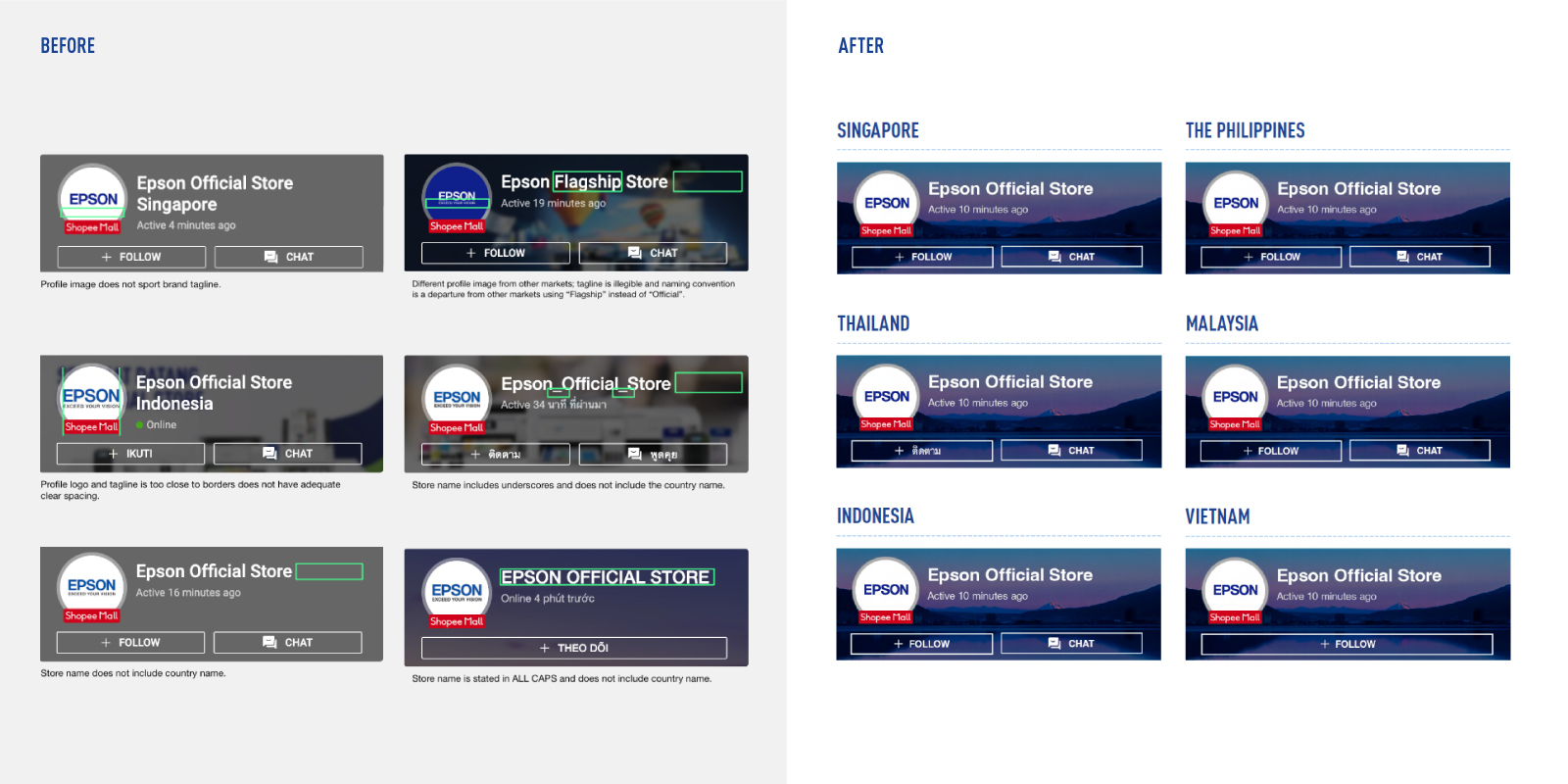
1. OFFICIAL STORE
PROFILE PHOTO
Standardising Profile Photos
One recurring issue was the incongruent profile photos across each region’s e-commerce stores. The logo, workmarks, and even name of the stores were vastly different which presented a fragmented digital brand image. We solved this by locking in one logo for all stores as a point
of reference.
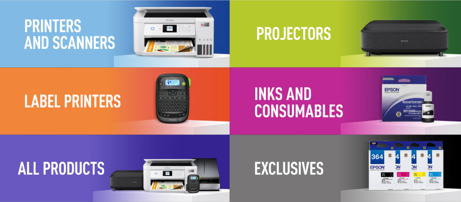
2. PRODUCT CATEGORISATION
COLOURS
Inconsistent Colour Usage
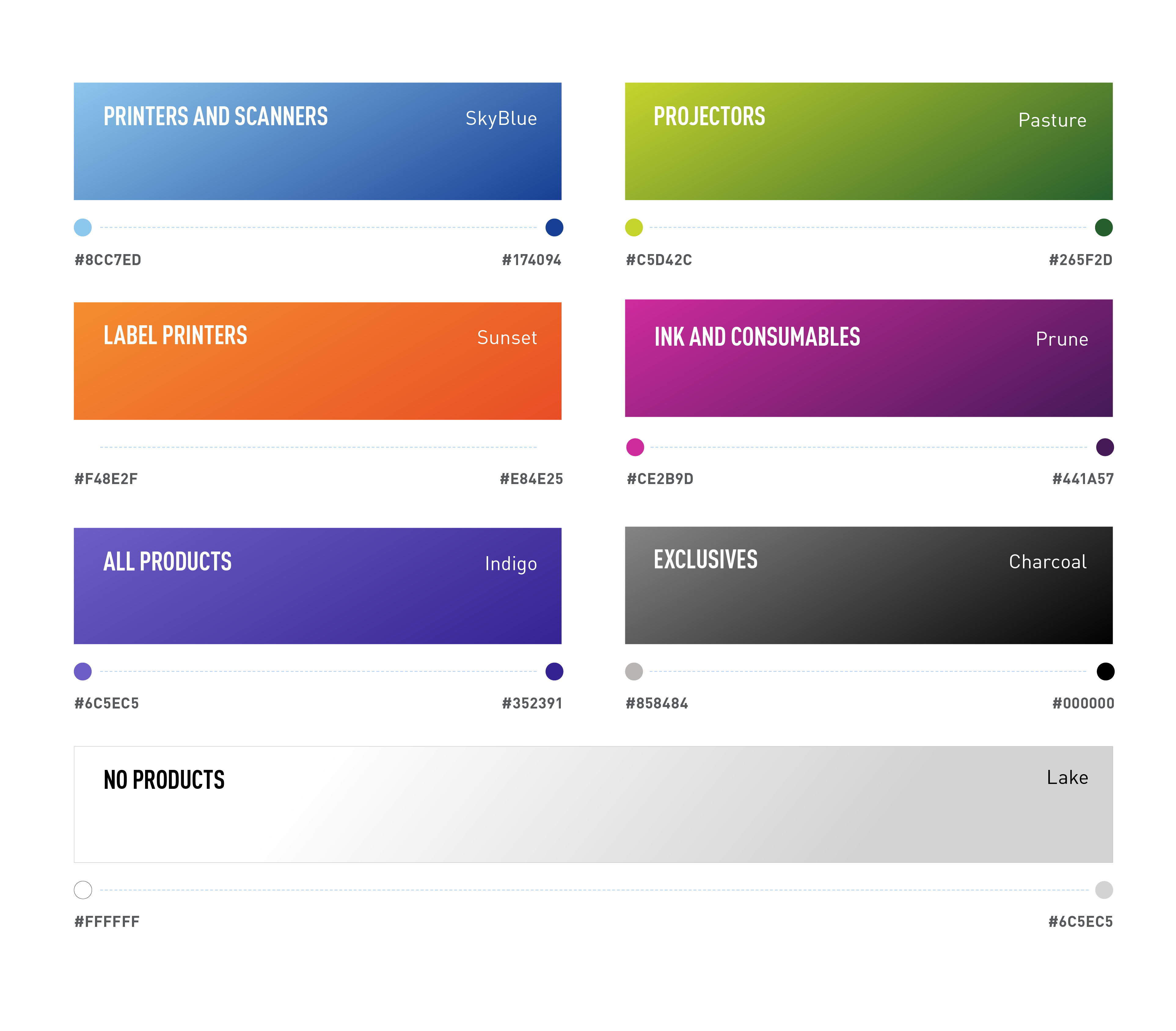
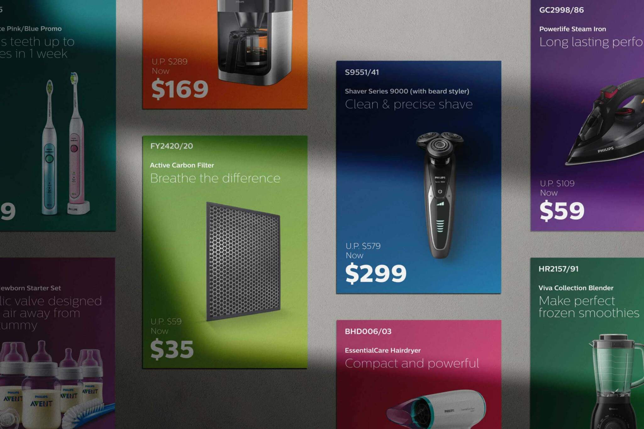
There was no categorical basis for how Epson’s products were visually represented. The multitude of colours used lacked strategic direction and failed to demonstrate any unified visual systems. This negatively affected product presentation and fragmented Epson’s brand identity.
Intuitively Colour Coded
Our branding and design team categorised the products into colours based on their popularity and demand. Printers and scanners, which comprised bulk of Epson’s product line, was coloured blue to be aligned with their brand logo.
Printers and Scanners - Sky Blue
Projectors - Pasture
Label printers - Sunset
Ink and Consumable - Prune
All Products - Indigo
Exclusives - Charcoal
No Products - Lake
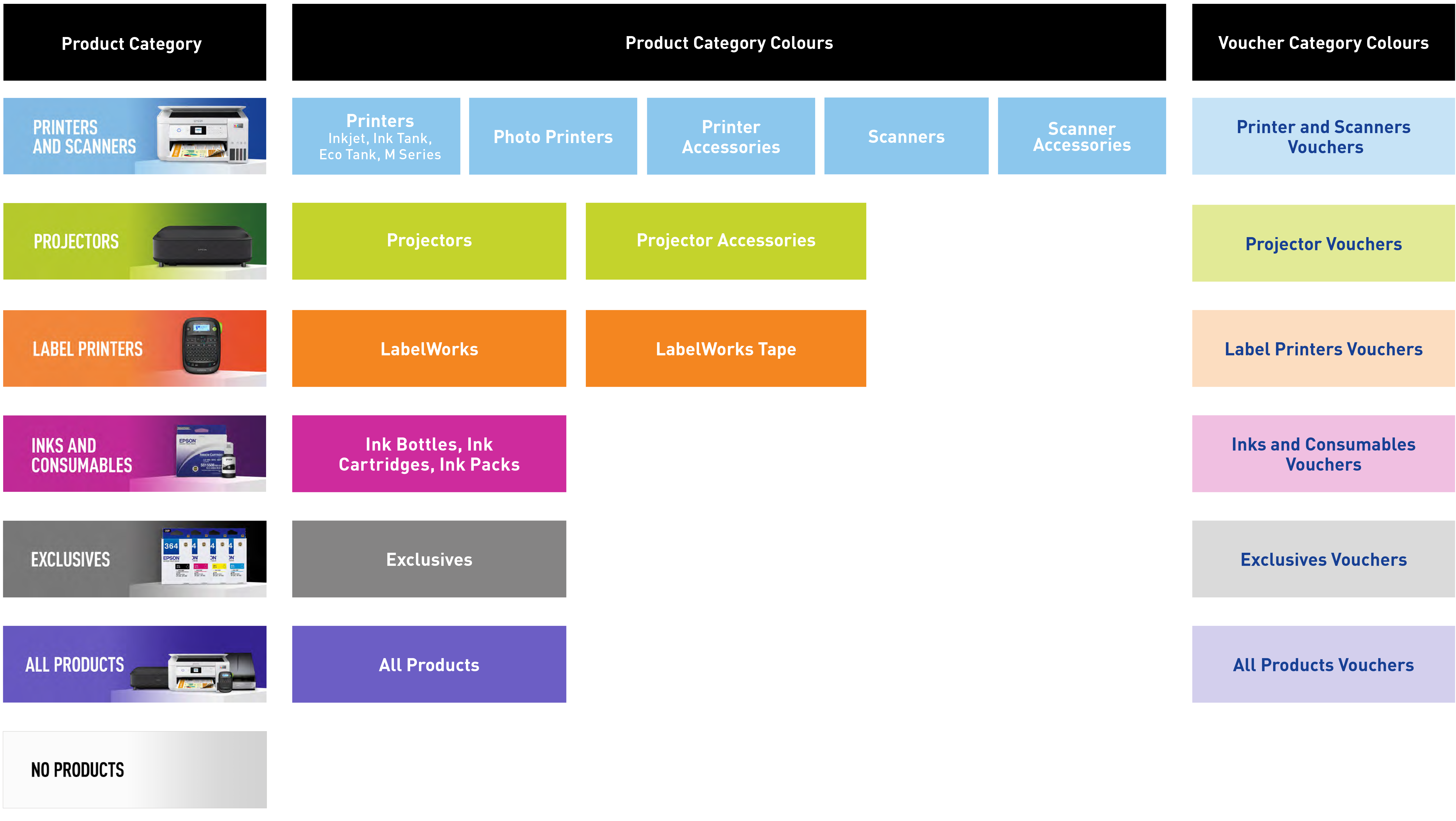
3. PRODUCT VOUCHERS
CATEGORY COLOURS
Extending The Idea
Once the Superminted team has these colours locked in, we took the idea even further and extended it to potential marketing materials that Epson would utilise. This included product vouchers that would be featured on their e-commerce platforms or EDMs sent to customers.
Adding Value In Our Work
What started out as a necessary system for categorising our Client’s products ended up being leveraged for further applications. Our branding and design team saw avenues for added value and implemented it for potential future use.
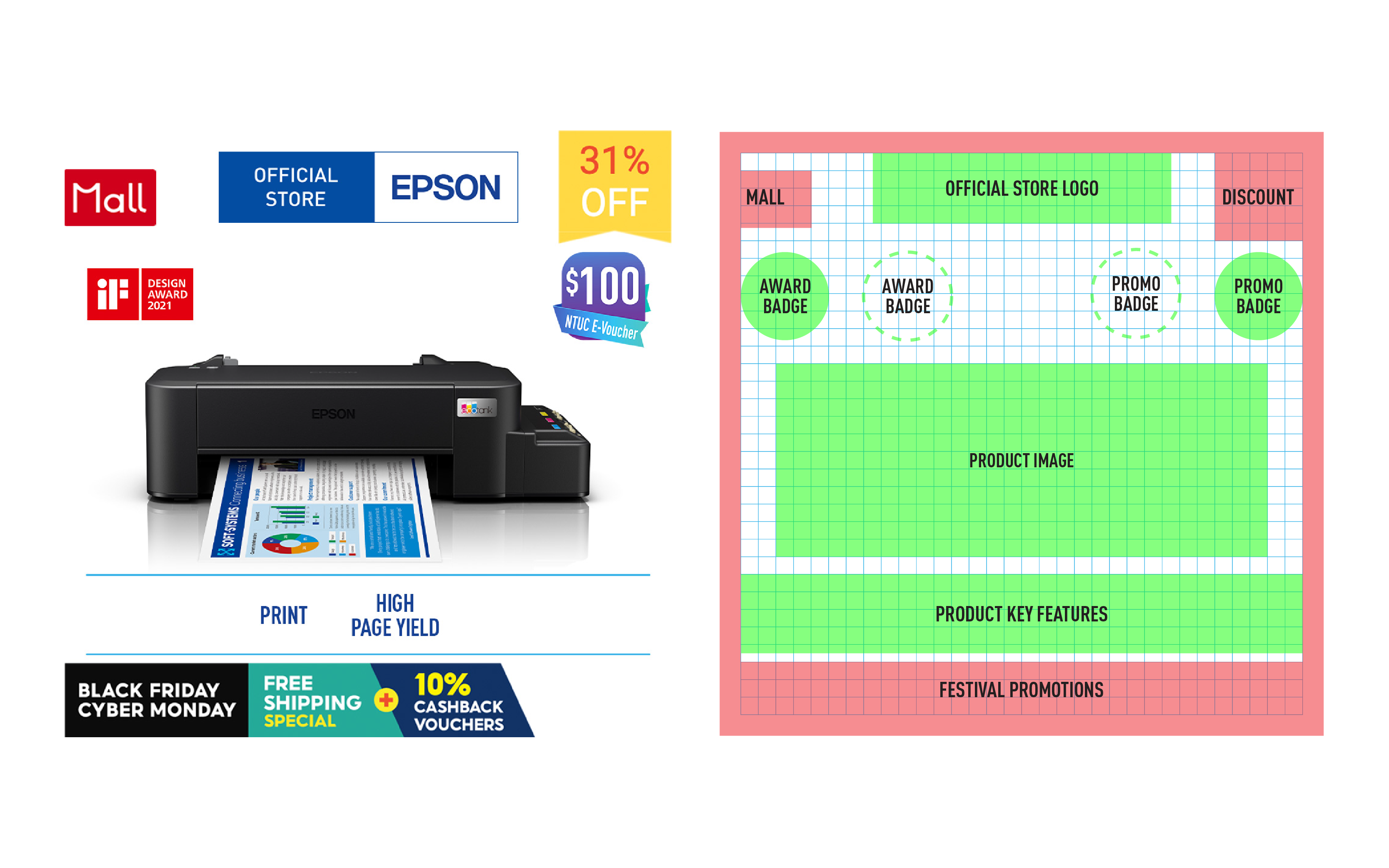
4. E-COMMERCE THUMBNAILS
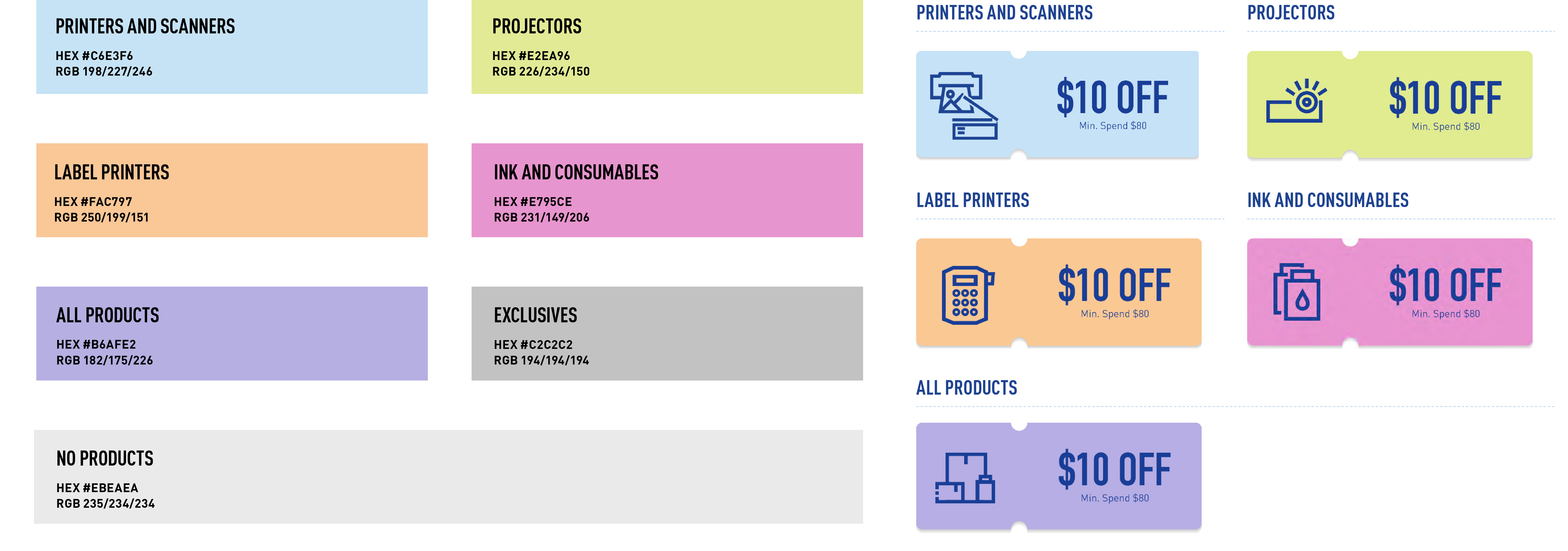
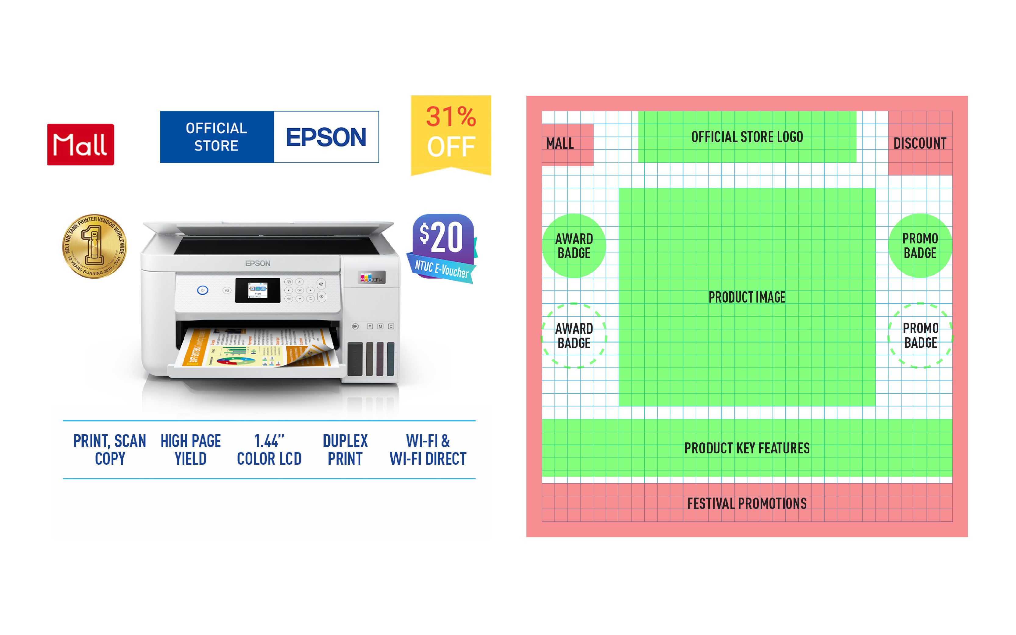
For All Sizes
We further customised three different grid templates for various existing Epson product sizes, accommodating the full range of products from tall to wide, and even long wide. These templates had to account for badge placements based on orientation and size of the product showcased.
Unified e-commerce Identity
Despite a core portion of their sales coming in from regional e-commerce platforms such as Shopee and Lazada, Epson’s various online stores utilised different product icons that contributed to a fragmented look and feel. In addition, many of the products lacked icons that displayed their USPs.
Lazada and Shopee
Creating two categories of product icons, one for each major e-commerce platform, Superminted then evaluated the thumbnails and designed templates based on the considerations of space for Shopee and Lazada’s e-commerce badge placements.
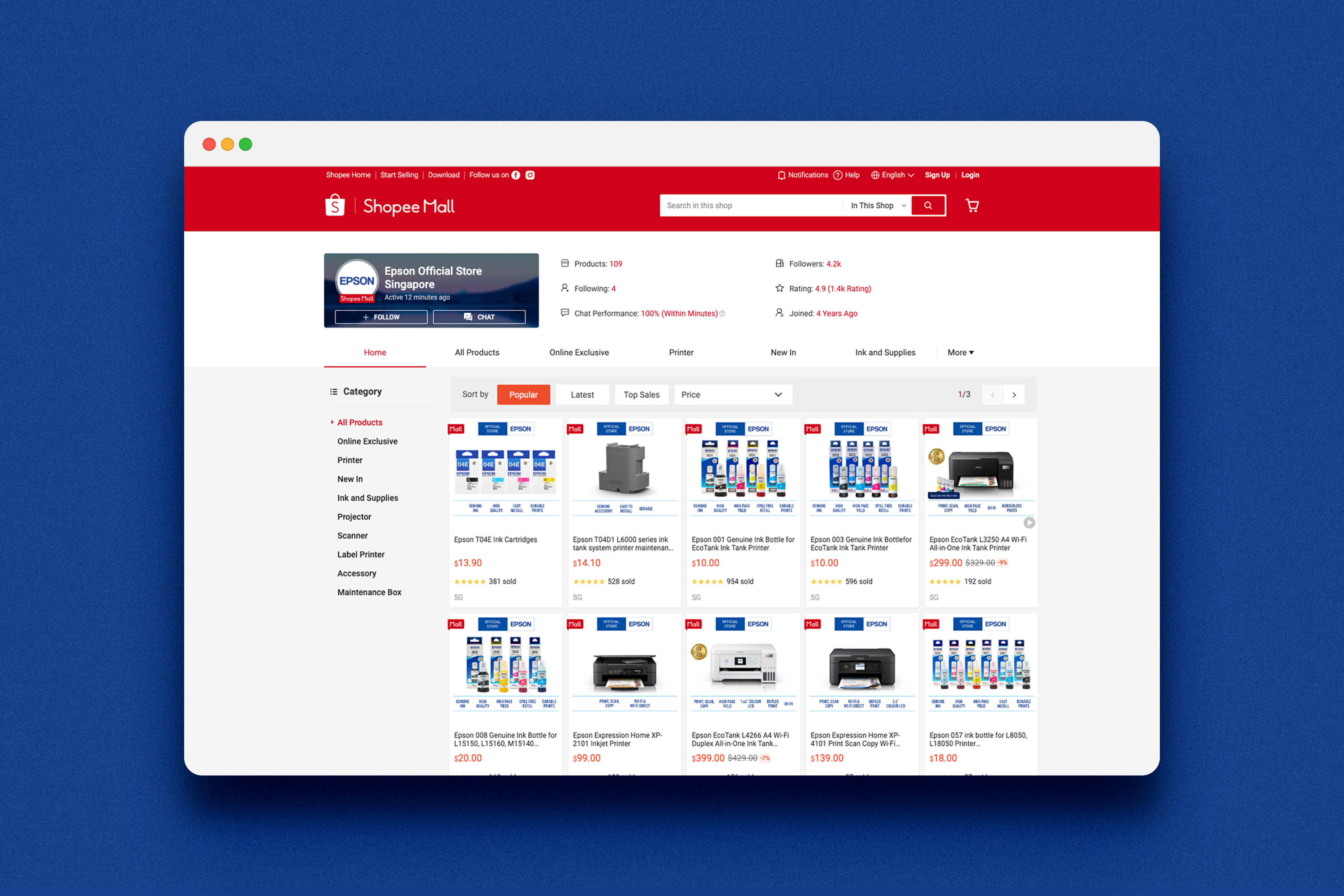
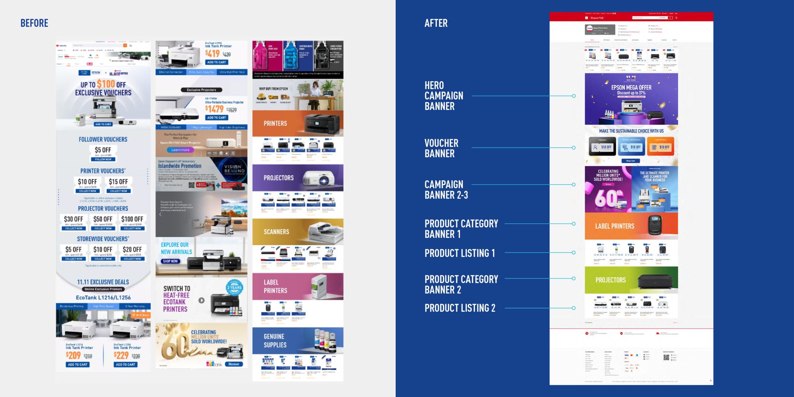
5. STORE ARCHITECTURE
Scrolling Through A Mess
With 12 different variations for Epson’s online stores, not only was Epson’s digital brand image incongruent but the online browsing experience for consumers took a big hit as well.
Polishing Overall Presentation
Leveraging this opportunity to revamp the wireframes and optimise the user experience, Superminted developed a standardised architecture for each Epson online store that aimed to emulate a microsite/landing page. This intuitively fostered a smoother flow for customers browsing through due to clear organisation of information and minimal visual clutter.
Selected Works

BelantaraBrand Identity

Sadia Chicken Collagen PackagingPackaging Design

HillhavenBrand Identity

Epson Brand Harmonisation PlaybookBrand Identity

Wilsafe SystemsBrand Identity

Haagen-Dazs FreezerBrand Experience
PHILLIPS APAC Carnival 2018Brand Identity

Pearl Consulting ServicesBrand Identity

Global Innovation Immersion ProgrammeBrand Identity

G.U.M Booth Tradeshow Design 2018Brand Identity

TERROIR MagazineEditorial Design

PHILLIPS APAC Lunar New YearEditorial Design